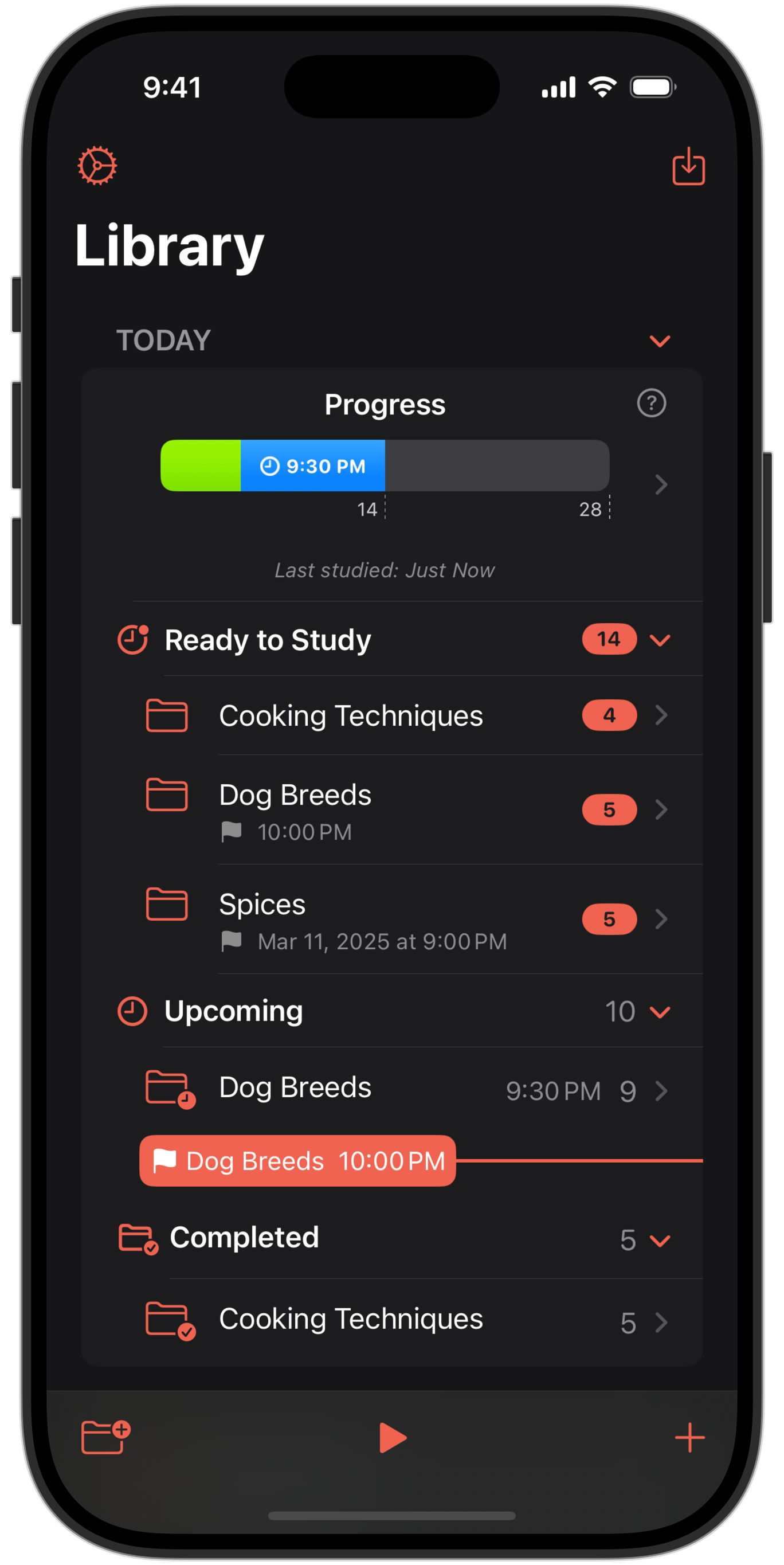
The last Advanced Learner feature that I plan for the first Benkyo Box release is out in beta: Study Deadlines. Deadlines are dates when it's important to have studied a set of cards. Deadlines are assigned to folders.
Normally, Benkyo Box automatically schedules your studies based on scores. There's a problem with this: it doesn't know about any important dates where they are relevant, like the day of a meeting or test. With deadlines, the app is aware of these dates and if a card would be scheduled after them, it'll schedule it before them instead, regardless of the current assigned study frequency of the card. Moreover, if you create cards right before the deadline, they'll appear in studies more frequently than normal so that they have a higher chance of showing up more than once before the important date:
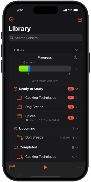
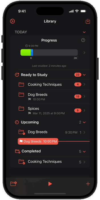
As shown above, deadlines are assigned to folders. The higher-frequency deadline schedule affects all cards in the folder. If you choose to hide a folder, its deadlines are hidden as well. They'll appear again when the folder is unhidden:
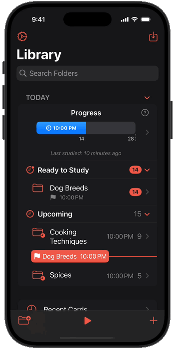
Deadlines are easy to find and manage in the Today section and Calendar:
In my daily use of the app, I usually want to study whatever's available for today, without having to think about what folder has those studies. Before, the Today screen is where you'd do that, but I think that's still too many steps. That's why I added a Study button to the Library screen, which opens the study view with everything that is currently available right away after opening the app. Since the Library view also shows your current progress, this is a great place to finish your daily studies without having to navigate across folders:
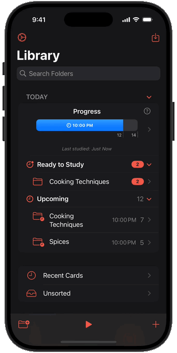
Since the Library screen is home to your studies, I focused on improving a few details that help you understand the study schedule. Now the "upcoming" studies bar displays the hour of the next study:
Benkyo Box is now much nicer when you use accessibility text sizes. The main lists and calendar have bespoke, larger layouts (reducing number of columns, moving UI elements from horizontal to vertical, etc) when accessibility sizes are used. Card creation screens also now support dynamic text sizes. Note: The image annotation screen doesn't resize because the document metrics have to be honored for annotations to make sense.
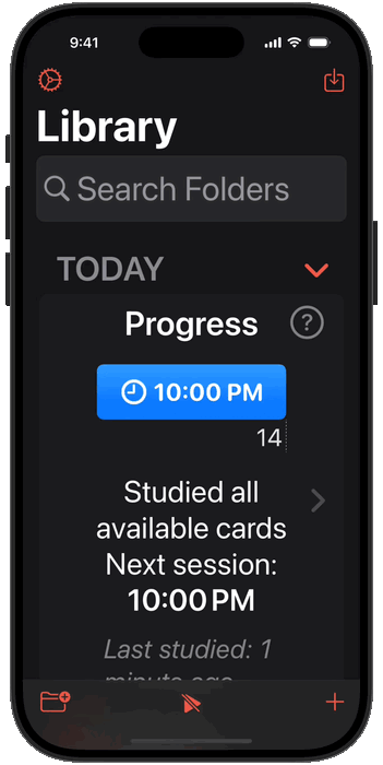
It feels closer and closer to the first AppStore release, but 1 more thing is left: completion states. The UI needs to do a better job at displaying and clarifying "completed" cards - cards that you know so well that won't show up in your studies anymore. This, I hope is the final feature before release. Thanks for testing!